
In Bootstrap 5 there are 12 different colours available to use, and each colour has 9 different shades you can make use of.
However, you can not use all these colours directly in your CSS since according to Bootstrap generating background and text colour for all the colours will lead to a bloated output CSS file. Hence, you can choose which colour you want from the bootstrap variable library and make a custom CSS class using that colour.
Generate CSS class for all base colours
If you wish to generate background colour and text colour for all the base colours. You can loop through the lists all our available base (500) colours which is stored in the $colors variable in the bootstrap library
@import "~bootstrap/scss/functions";
@import "~bootstrap/scss/variables";
@import "~bootstrap/scss/utilities";

//Generating bg and text color for all base Colors
@each $color, $value in $colors {
  .bg-#{$color}{
        background-color: $value !important;
  }

  .text-#{$color}{
    color: $value !important;
  }
}

@import '~bootstrap/scss/bootstrap';
Generate CSS class for all shades of gray colours
If you wish to generate background colour and text colour for all the base colours. You can loop through the lists of gray shade colours which is stored in the $grays variable in the bootstrap library
@import "~bootstrap/scss/functions";
@import "~bootstrap/scss/variables";
@import "~bootstrap/scss/utilities";

//Generating All Shades of Gray
@each $key, $value in $grays {
  .bg-gray-#{$key}{
        background-color: $value !important;
  }

  .text-gray-#{$key}{
    color: $value !important;
  }
}

// Bootstrap
@import '~bootstrap/scss/bootstrap';
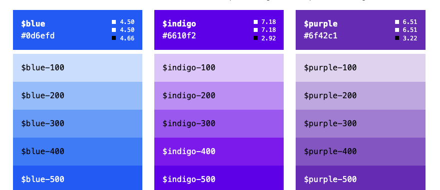
Generate CSS class for all shades of all colours
This is not recommended generating css classes for all shades of all available colours since it will bloat your CSS file and make it large. However, if you still wish to do this, you can use the below code.
@import "~bootstrap/scss/functions";
@import "~bootstrap/scss/variables";
@import "~bootstrap/scss/utilities";

$blues : ( "100": $blue-100, "200": $blue-200, "300": $blue-300, "400": $blue-400, "500": $blue-500, "600": $blue-600, "700": $blue-700, "800": $blue-800, "900": $blue-900) !default;
$indigos: ( "100": $indigo-100, "200": $indigo-200, "300": $indigo-300, "400": $indigo-400, "500": $indigo-500, "600": $indigo-600, "700": $indigo-700, "800": $indigo-800, "900": $indigo-900) !default;
$purples: ( "100": $purple-100, "200": $purple-200, "300": $purple-300, "400": $purple-400, "500": $purple-500, "600": $purple-600, "700": $purple-700, "800": $purple-800, "900": $purple-900) !default;
$pinks: ( "100": $pink-100, "200": $pink-200, "300": $pink-300, "400": $pink-400, "500": $pink-500, "600": $pink-600, "700": $pink-700, "800": $pink-800, "900": $pink-900) !default;
$reds: ( "100": $red-100, "200": $red-200, "300": $red-300, "400": $red-400, "500": $red-500, "600": $red-600, "700": $red-700, "800": $red-800, "900": $red-900) !default;
$oranges: ( "100": $orange-100, "200": $orange-200, "300": $orange-300, "400": $orange-400, "500": $orange-500, "600": $orange-600, "700": $orange-700, "800": $orange-800, "900": $orange-900) !default;
$yellows: ( "100": $yellow-100, "200": $yellow-200, "300": $yellow-300, "400": $yellow-400, "500": $yellow-500, "600": $yellow-600, "700": $yellow-700, "800": $yellow-800, "900": $yellow-900) !default;
$greens: ( "100": $green-100, "200": $green-200, "300": $green-300, "400": $green-400, "500": $green-500, "600": $green-600, "700": $green-700, "800": $green-800, "900": $green-900) !default;
$teals: ( "100": $teal-100, "200": $teal-200, "300": $teal-300, "400": $teal-400, "500": $teal-500, "600": $teal-600, "700": $teal-700, "800": $teal-800, "900": $teal-900) !default;
$cyans: ( "100": $cyan-100, "200": $cyan-200, "300": $cyan-300, "400": $cyan-400, "500": $cyan-500, "600": $cyan-600, "700": $cyan-700, "800": $cyan-800, "900": $cyan-900) !default;

@each $key, $value in $blues {
  .bg-blue-#{$key}{
        background-color: $value !important;
  }

  .text-blue-#{$key}{
    color: $value !important;
  }
}

@each $key, $value in $purples {
  .bg-purple-#{$key}{
        background-color: $value !important;
  }

  .text-purple-#{$key}{
    color: $value !important;
  }
}

@each $key, $value in $indigos {
  .bg-indigo-#{$key}{
        background-color: $value !important;
  }

  .text-indigo-#{$key}{
    color: $value !important;
  }
}

@each $key, $value in $pinks {
  .bg-pink-#{$key}{
        background-color: $value !important;
  }

  .text-pink-#{$key}{
    color: $value !important;
  }
}

@each $key, $value in $reds {
  .bg-red-#{$key}{
        background-color: $value !important;
  }

  .text-red-#{$key}{
    color: $value !important;
  }
}

@each $key, $value in $oranges {
  .bg-orange-#{$key}{
        background-color: $value !important;
  }

  .text-orange-#{$key}{
    color: $value !important;
  }
}

@each $key, $value in $yellows {
  .bg-yellow-#{$key}{
        background-color: $value !important;
  }

  .text-yellow-#{$key}{
    color: $value !important;
  }
}

@each $key, $value in $greens {
  .bg-green-#{$key}{
        background-color: $value !important;
  }

  .text-green-#{$key}{
    color: $value !important;
  }
}


@each $key, $value in $teals {
  .bg-teal-#{$key}{
        background-color: $value !important;
  }

  .text-teal-#{$key}{
    color: $value !important;
  }
}

@each $key, $value in $cyans {
  .bg-cyan-#{$key}{
        background-color: $value !important;
  }

  .text-cyan-#{$key}{
    color: $value !important;
  }
}

@import '~bootstrap/scss/bootstrap';
There you go, have fun using the variety of bootstrap colors and shades.