
In this lesson, let's learn about slots in Component and how we can use them to pass the content into the Components.
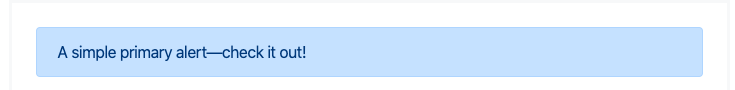
Consider you are working with the Bootstrap framework, where to display an alert box you have to put the following mark-up in your HTML.
<div class="alert alert-primary" role="alert"> A simple primary alert—check it out! </div>And this gives you a simple alert box in the HTML with basic styling.
There are different colors of text boxes for different class attached to the alert box, For details read Bootstrap Alert
We are looking to make a Vue Component version of this Alert Box wherein we can get the same output with a shorter element and along with a relevant font-awesome icon just before the content.
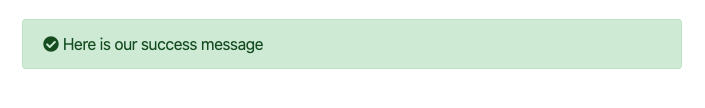
So <alert-success>Here is our success message<.alert-success> Will give you the following output.
Let's see how we can achieve this with Vue Component.
        Vue.component('alert-success',{
            template: `<div class="alert alert-success" role="alert">
                        <i class="fa fa-check-circle"></i> <slot></slot>
                        </div>`
        });

        let app = new Vue({
            el: '#app',
        });
We have defined the basic markup of Bootstrap Alert inside the template of our component. And in the content we have a font-awesome icon defined followed by slot element.
As you’ll see above, we just add the slot where we want our content to go – and that’s it. We’re done!
In our HTML we can now use the following markup anywhere in your HTML to show success alert box.
<alert-sucess>Your content</alert-sucess>You can now build similar Bootstrap alert component for other alert boxes.