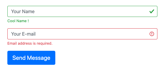
 There are four classes provided by bootstrap that helps us to style our form to display validation results.
- is-valid
- is-invalid
- valid-feedback (Display's only if is-valid class is applied to the input)
- invalid-feedback (Display's only if is-invalid class is applied to the input)
was-validated class to your form.
For server-side validation, you need to add the class .is-valid or .is-invalid to your input field, depending upon the validation success or failure.
And to display the message, you need to add a div just below the input field with a class of .valid-feedback in case of validation success and .invalid-feedback in case of validation failure.
Also, note that the valid-feedback and invalid-feedback display is by default set to none, they will only appear when the input have the is-valid / is-invalid classes applied.
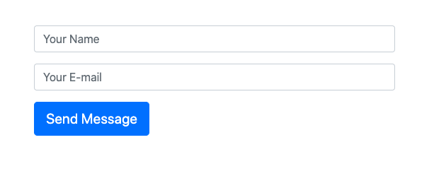
Here is how.
<form class="contact-form" method="POST" novalidate="novalidate">
        <div class="form-row">
            <div class="form-group col">
                <input type="text" placeholder="Your Name" value="" maxlength="100" class="form-control is-valid" name="name" >
                <div class="valid-feedback">
                    Cool Name !
                </div>
            </div>
        </div>
        <div class="form-row">
            <div class="form-group col">
                <input type="email" placeholder="Your E-mail" value=""  maxlength="100" class="form-control is-invalid" name="email" required="">
                <div class="invalid-feedback">
                    Email address is required.
                </div>
             </div>
        </div>
        <div class="form-row">
            <div class="form-group col">
                <input type="submit" value="Send Message" class="btn btn-primary btn-lg mb-5" data-loading-text="Loading...">
            </div>
        </div>
    </form>