In this article let's build a responsive Navbar using TailwindCSS and AlpineJS. We will use TailwindCSS for the styling and we will sprinkle the javascript behaviour of the navbar using AlpineJS.
1. Add Nav Structure to your HTML Page
Assuming you have TailwindCSS installed in your project, In this step, lets just add a
nav element to the page which has a bottom border and inside that we will add a div which defines the width of the navbar
<!DOCTYPE html>
<html lang="en">
<head>
    <meta charset="UTF-8">
    <meta http-equiv="X-UA-Compatible" content="IE=edge">
    <meta name="viewport" content="width=device-width, initial-scale=1.0">
    <link href="/css/tailwind.css" rel="stylesheet">
    <script src="//unpkg.com/alpinejs" defer></script>
    <title>TailwindCSS Navbar</title>
</head>
<body>
    <!-- Nav Bar-->
    <nav class="border-b">
        <div class="container max-w-screen-lg mx-auto flex justify-between h-14">

        </div>
    </nav>
</body>
</html>
border-b adds a bottom border to the nav element
We have added
max-w-screen-lg to the div container which will restrict the width of navbar to
1024px
flex justify-between converts the navbar to a flex container with all appropriate gap in between the elements.
Let's move onto the next step.
2. Add Logo and Brand
A Navbar usually contains logo and name of the brand website that you are building. Let's add that into the navbar
<nav class="border-b">
    <div class="container max-w-screen-lg mx-auto flex justify-between h-14">
        <!-- Brand-->
        <a href="#" class="flex items-center cursor-pointer hover:bg-purple-50 px-2 ml-3">
            <!-- Logo-->
            <div class="rounded bg-purple-400 text-white font-bold w-10 h-10 flex justify-center text-3xl pt-0.5">A</div>
            <div class="text-gray-700 font-semibold ml-2">Alphabet Tech</div>
        </a>
    </div>
</nav>
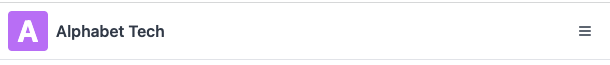
We have wrapped two div inside a tag, one div is for logo and another one is for the brand name. Here is how the output looks like

3. Add Nav Items / Links
Now since we have the navbar structure with logo and branding ready, let's go ahead and add links to the navbar. Through this links user can navigate to different areas of the website.
<nav class="border-b">
    <div class="container max-w-screen-lg mx-auto flex justify-between h-14">
        <!-- Brand-->
        <a href="#" class="flex items-center cursor-pointer hover:bg-purple-50 px-2 ml-3">
            <!-- Logo-->
            <div class="rounded bg-purple-400 text-white font-bold w-10 h-10 flex justify-center text-3xl pt-0.5">A</div>
            <div class="text-gray-700 font-semibold ml-2">Alphabet Tech</div>
        </a>
        <!-- Nav Links-->
        <ul class="flex text-gray-700 text-base">
            <li class="px-3 cursor-pointer hover:bg-purple-50 flex items-center hover:text-gray-800">
                <a href="#">Laravel</a>
            </li>
            <li class="px-3 cursor-pointer hover:bg-purple-50 flex items-center hover:text-gray-800">
                <a href="#">Livewire</a>
            </li>
            <li class="px-3 cursor-pointer hover:bg-purple-50 flex items-center hover:text-gray-800">
                <a href="#">TailwindCSS</a>
            </li>
            <li class="px-3 cursor-pointer hover:bg-purple-50 flex items-center hover:text-gray-800">
                <a href="#">Alpine JS</a>
            </li>
            <li class="px-3 cursor-pointer hover:bg-purple-50 flex items-center hover:text-gray-800">
                <a href="#">About</a>
            </li>
        </ul>
    </div>
</nav>
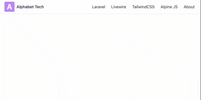
We have added structure of unordered list in the HTML with 5 links. Each of the list item is a
flex box with
items-center property since this brings the nav items to the middle of the navigation bar vertically.
Along with this we have added some basic styling to change the text and background colour on
hover.
Here is how the navigation bar looks with the nav items added

The nav bar looks great on the desktop, but there is still some work needed to be done to make it work well on all screen sizes.
4. Add Mobile Menu Button and Accessibility roles and attributes
Let's add a new button with the hamburger menu icon, by clicking on the which user can toggle the view of nav items on the smaller screens.
<nav class="border-b">
    <div class="container max-w-screen-lg mx-auto flex justify-between h-14">
        <!-- Brand-->
        <a href="#" class="flex items-center cursor-pointer hover:bg-purple-50 px-2 ml-3">
            <!-- Logo-->
            <div class="rounded bg-purple-400 text-white font-bold w-10 h-10 flex justify-center text-3xl pt-0.5">A</div>
            <div class="text-gray-700 font-semibold ml-2">Alphabet Tech</div>
        </a>
        <!-- Navbar Toggle Button -->
        <button class="text-gray-700 p-2 rounded hover:border focus:border focus:bg-gray-100 my-2 mr-5" type="button" aria-controls="navbar-main" aria-expanded="false" aria-label="Toggle navigation">
            <svg class="w-5 h-4" fill="none" stroke="currentColor" viewBox="0 0 24 24" xmlns="http://www.w3.org/2000/svg"><path stroke-linecap="round" stroke-linejoin="round" stroke-width="2" d="M4 6h16M4 12h16M4 18h16"></path></svg>
        </button>
        <!-- Nav Links-->
        <ul class="flex text-gray-700 text-base" id="navbar-main">
            <li class="px-3 cursor-pointer hover:bg-purple-50 flex items-center hover:text-gray-800">
                <a href="#">Laravel</a>
            </li>
            <li class="px-3 cursor-pointer hover:bg-purple-50 flex items-center hover:text-gray-800">
                <a href="#">Livewire</a>
            </li>
            <li class="px-3 cursor-pointer hover:bg-purple-50 flex items-center hover:text-gray-800">
                <a href="#">TailwindCSS</a>
            </li>
            <li class="px-3 cursor-pointer hover:bg-purple-50 flex items-center hover:text-gray-800">
                <a href="#">Alpine JS</a>
            </li>
            <li class="px-3 cursor-pointer hover:bg-purple-50 flex items-center hover:text-gray-800">
                <a href="#">About</a>
            </li>
        </ul>
    </div>
</nav>
Notice that we have added the button, and have also added few ARIA attributes to the button
aria-controls="navbar-main" aria-expanded="false" aria-label="Toggle navigation" , These help people with disability to navigate the site.
aria-controls indicate which part of the dom is getting controlled by this button. Add the id navbar-main to the
ul tag
aria-exanded denotes the current state of the nav menu, which by default is closed.
Here is how the navbar now looks like

The toggle button is in the middle and the nav items are still visible on smaller screens, thats not what we want. Let's fix that.
5. Change visibility of Toggle button and Nav Menu
The navbar menu is visible on smaller screens and hidden otherwise. To achieve this add
hidden md:block to the button class.
Also, the nav menu is hidden on smaller screens and is a flex box on larger screens, To achieve this add
hidden md:flex to the
ul element.
<!-- Navbar Toggle Button -->
<button class="block md:hidden text-gray-700 p-2 rounded hover:border focus:border focus:bg-gray-100 my-2 mr-5" type="button" aria-controls="navbar-main" aria-expanded="false" aria-label="Toggle navigation">
    <svg class="w-5 h-4" fill="none" stroke="currentColor" viewBox="0 0 24 24" xmlns="http://www.w3.org/2000/svg"><path stroke-linecap="round" stroke-linejoin="round" stroke-width="2" d="M4 6h16M4 12h16M4 18h16"></path></svg>
</button>
<!-- Nav Links-->
<ul class="hidden md:flex text-gray-700 text-base " id="navbar-main">
This is how the navbar looks on the smaller screens.
6. Add AlpineJS
Next up, lets sprinkle some AlpineJS to add behaviour to the navbar.
    <nav class="border-b">
        <div x-data="{showMenu : false}" class="container max-w-screen-lg mx-auto flex justify-between h-14">
            <!-- Brand-->
            <a href="#" class="flex items-center cursor-pointer hover:bg-purple-50 px-2 ml-3">
                <!-- Logo-->
                <div class="rounded bg-purple-400 text-white font-bold w-10 h-10 flex justify-center text-3xl pt-0.5">A</div>
                <div class="text-gray-700 font-semibold ml-2">Alphabet Tech</div>
            </a>
            <!-- Navbar Toggle Button -->
            <button @click="showMenu = !showMenu" class="block md:hidden text-gray-700 p-2 rounded hover:border focus:border focus:bg-gray-100 my-2 mr-5" type="button" aria-controls="navbar-main" aria-expanded="false" aria-label="Toggle navigation">
                <svg class="w-5 h-4" fill="none" stroke="currentColor" viewBox="0 0 24 24" xmlns="http://www.w3.org/2000/svg"><path stroke-linecap="round" stroke-linejoin="round" stroke-width="2" d="M4 6h16M4 12h16M4 18h16"></path></svg>
            </button>
            <!-- Nav Links-->
            <ul class="md:flex text-gray-700 text-base mr-3"
                :class="showMenu ? 'block absolute top-14 border-b bg-white w-full p-2' : 'hidden'"
                id="navbar-main" x-cloak>
                <li class="px-3 cursor-pointer hover:bg-purple-50 flex items-center hover:text-gray-800" :class="showMenu && 'py-1'">
                    <a href="#">Laravel</a>
                </li>
                <li class="px-3 cursor-pointer hover:bg-purple-50 flex items-center hover:text-gray-800" :class="showMenu && 'py-1'">
                    <a href="#">Livewire</a>
                </li>
                <li class="px-3 cursor-pointer hover:bg-purple-50 flex items-center hover:text-gray-800" :class="showMenu && 'py-1'">
                    <a href="#">TailwindCSS</a>
                </li>
                <li class="px-3 cursor-pointer hover:bg-purple-50 flex items-center hover:text-gray-800" :class="showMenu && 'py-1'">
                    <a href="#">Alpine JS</a>
                </li>
                <li class="px-3 cursor-pointer hover:bg-purple-50 flex items-center hover:text-gray-800" :class="showMenu && 'py-1'">
                    <a href="#">About</a>
                </li>
            </ul>
        </div>
    </nav>
7. Complete NavBar Code
    <nav class="border-b">
        <div x-data="{showMenu : false}" class="container max-w-screen-lg mx-auto flex justify-between h-14">
            <!-- Brand-->
            <a href="#" class="flex items-center cursor-pointer hover:bg-purple-50 px-2 ml-3">
                <!-- Logo-->
                <div class="rounded bg-purple-400 text-white font-bold w-10 h-10 flex justify-center text-3xl pt-0.5">A</div>
                <div class="text-gray-700 font-semibold ml-2">Alphabet Tech</div>
            </a>
            <!-- Navbar Toggle Button -->
            <button @click="showMenu = !showMenu" class="block md:hidden text-gray-700 p-2 rounded hover:border focus:border focus:bg-gray-100 my-2 mr-5" type="button" aria-controls="navbar-main" aria-expanded="false" aria-label="Toggle navigation">
                <svg class="w-5 h-5" fill="none" stroke="currentColor" viewBox="0 0 24 24" xmlns="http://www.w3.org/2000/svg"><path stroke-linecap="round" stroke-linejoin="round" stroke-width="2" d="M4 6h16M4 12h16M4 18h16"></path></svg>
            </button>
            <!-- Nav Links-->
            <ul class="md:flex text-gray-700 text-base mr-3 origin-top"
                :class="{ 'block absolute top-14 border-b bg-white w-full p-2': showMenu, 'hidden': !showMenu}"
                id="navbar-main" x-cloak>
                <li class="px-3 cursor-pointer hover:bg-purple-50 flex items-center hover:text-gray-800" :class="showMenu && 'py-1'">
                    <a href="#">Laravel</a>
                </li>
                <li class="px-3 cursor-pointer hover:bg-purple-50 flex items-center hover:text-gray-800" :class="showMenu && 'py-1'">
                    <a href="#">Livewire</a>
                </li>
                <li class="px-3 cursor-pointer hover:bg-purple-50 flex items-center hover:text-gray-800" :class="showMenu && 'py-1'">
                    <a href="#">TailwindCSS</a>
                </li>
                <li class="px-3 cursor-pointer hover:bg-purple-50 flex items-center hover:text-gray-800" :class="showMenu && 'py-1'">
                    <a href="#">Alpine JS</a>
                </li>
                <li class="px-3 cursor-pointer hover:bg-purple-50 flex items-center hover:text-gray-800" :class="showMenu && 'py-1'">
                    <a href="#">About</a>
                </li>
            </ul>
        </div>
    </nav>