If you have used CSS frameworks, you must have used the container class, TailwindCSS does also have a container utility class but it certainly differs a bit from other frameworks.
In this article, we will cover the following
Tailwindcss container
In this article let's understand TailwindCSS containers.
According to the official docs of tailwindcss,
The container class sets the max-width of an element to match the min-width of the current breakpoint., Well this sounds a bit complicated. Let's understand this in beginners' terms.
TailwindCSS have a different breakpoint which indicates the minimum width of the screen size. By default tailwindCSS have five breakpoints
| Breakpoint |
Screen Size |
| sm |
>=640px |
| md |
>=768px |
| lg |
>=1024px |
| xl |
>=1280px |
| 2xl |
>=1536px |
When we use container class on an element, Instead of fluid layout, we now have a
fixed width layout. The width of the container changes as per the screen size as follows
By default you'll get the following container width on the screen size range
| Container Width |
Screen Size Range |
| 640px |
640px to 767px |
| 768px |
768px to 1023px |
| 1024px |
1024px to 1279px |
| 1280px |
1280px to 1536px |
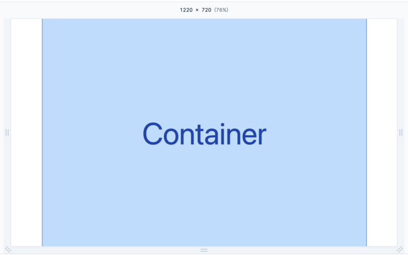
Thus container is usually used when you'd like to define a definite area in the webpage for the content to be confined in.
Take a look through the visual gif how the container width changes accroding to the screen size.
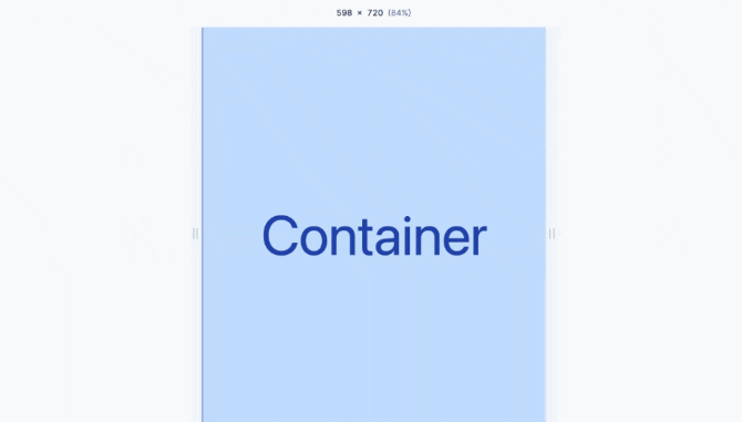
Notice that by default the container is fixed to the left side of the webpage. But ideally we would like it to be
centered in the middle of the screen. Let's learn that how to do that in the next section.
Configure container width.
If you are looking to change the default width of container for each breakpoint, you can do so by extending the defaults in the
tailwind.config.js file.
// tailwind.config.js
module.exports = {
  mode: 'jit',
  theme: {
    container: {
      // default breakpoints but with 40px removed
      screens: {
        sm: '600px',
        md: '728px',
        lg: '984px',
        xl: '1240px',
        '2xl': '1496px',
      },
    },
  },
}
Putting the container in the center of the screen.
Usually you would want the container to be in the center of the screen horizontally, so that container width is less than the screen size there should margin on the both ends of the screen.
You can do this by applying
mx-auto class on the container.
<div class="container mx-auto">
</div>
If you are looking to center the
container in your application by default, set the
center option to true in the
theme.container section of your config file.
Here is how you can do it in
tailwind.config.js file
module.exports = {
  theme: {
    container: {
      center: true,
    },
  },
}
Add horizontal padding to container.
Often you would want a little padding between the container border and your content, to add horizontal padding you can make use of
px-{amount} utility class of tailwindcss.
<div class="container mx-auto px-5">
</div>
If you want to specify the default value of padding for your container element. Here is how you can do so in the
tailwind.config.js file
module.exports = {
  theme: {
    container: {
      padding: '2rem',
    },
  },
}
If you want to specify a different padding amount for each breakpoint, use an object to provide a default value and any breakpoint-specific overrides:
module.exports = {
  theme: {
    container: {
      padding: {
        DEFAULT: '1rem',
        sm: '2rem',
        lg: '4rem',
        xl: '5rem',
        '2xl': '6rem',
      },
    },
  },
};
Limit container width at certain breakpoint
If you would like your container width to not exceed after a certain break point you can make use of max-w-screen-{breakpoint} utility class.
For example if you would like the max size of your container to be
1024px, then you can use max-w-screen-lg class along with the container class.
<div class="container max-w-screen-lg mx-auto px-5">
</div>
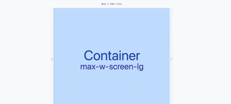
As demonstrated in the visual, the container width will be same as the width of screen till 1024 px and after that the container will be restricted to the width of
1024px.
If you would like
container max width on lower screen sizes then you can choose to apply
max-w-screen-lg only for screen size large and above
<div class="container lg:max-w-screen-lg mx-auto px-5">
</div>
This covers all about nitty gritty of using container utility class in tailwindcss. You can read more about
Tailwindcss Container in the official docs.